Brand Controls
Manage brand consistency without page-by-page edits.
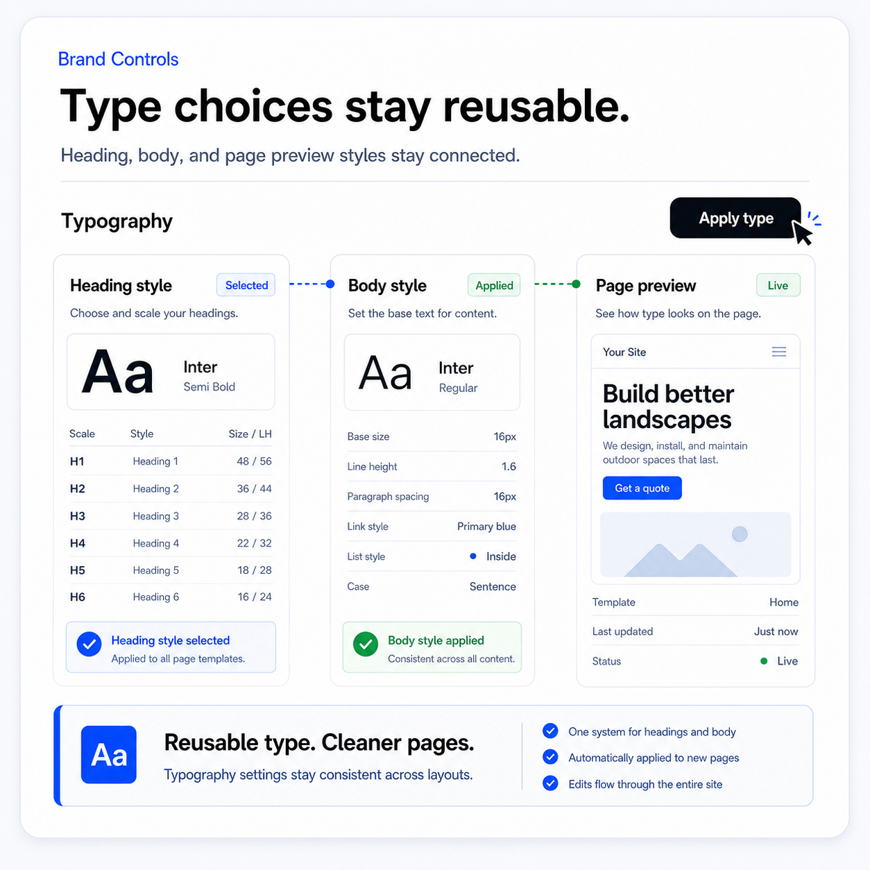
Control typography, color, spacing, headers, and reusable theme parts once, then apply changes across the full website.
Brand Controls keep the website from becoming visually random. Theme Builder, tokens, typography, color, spacing, headers, footers, and reusable sections make every new page feel intentional.
Keep every page visually consistent from one brand system
Control typography, color, spacing, headers, and reusable theme parts once, then apply changes across the full website.
The brand system should be editable, not hardcoded.
Paazaa keeps visual decisions in Theme Builder so the site can change direction without rebuilding every page.
Open Theme Gallery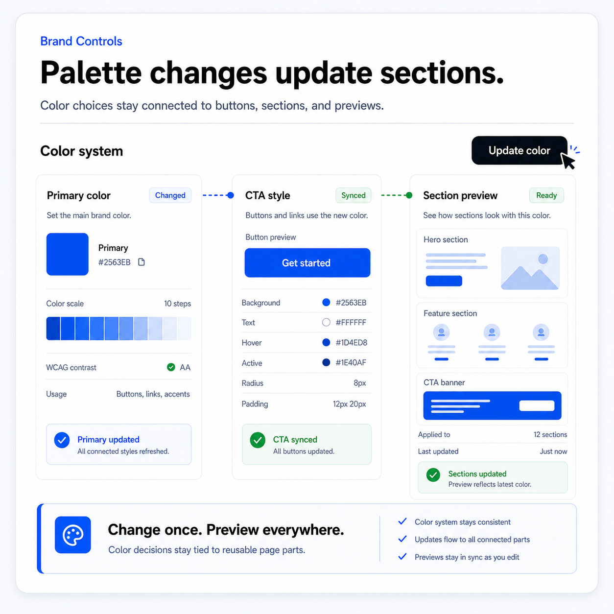
Make the content readable across the whole website.
Typography controls matter most on real pages: landing pages, CMS content, forms, checkout, dashboards, and resource pages.
Open AI Website Builder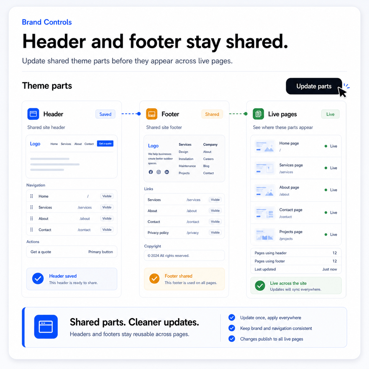
Reuse headers, footers, and repeated sections.
Shared parts keep the website consistent while still letting individual pages focus on their own message.
Open Pages & Publishing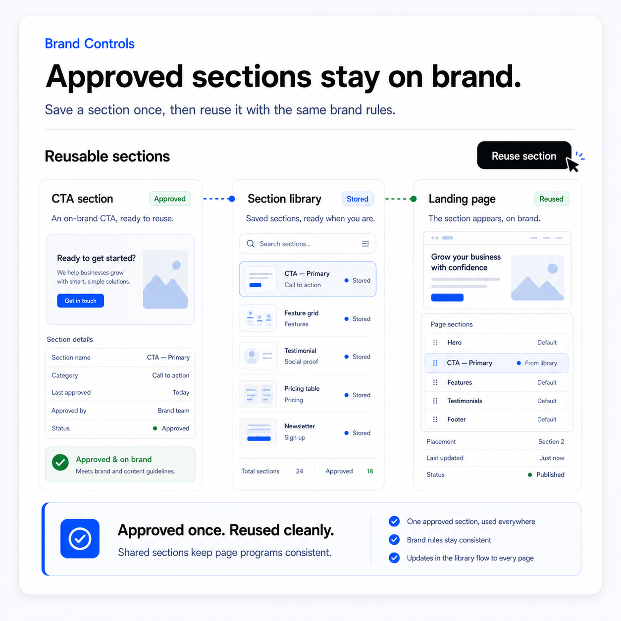
Keep new pages from drifting away from the brand.
As AI, templates, and builders create more pages, Brand Controls keep the output tied to the same visual language.
Open Media LibraryWhat improves when Theme Builder controls the visual system.
Make every page feel connected.
Brand Controls keep the website from becoming visually random. Theme Builder, tokens, typography, color, spacing, headers, footers, and reusable sections make every new page feel intentional.
Keep every page visually consistent from one brand system.
Control typography, color, spacing, headers, and reusable theme parts once, then apply changes across the full website.
Theme Builder
The primary place for visual system decisions.
Tokens
Reusable design values for color, type, spacing, and shape.
Theme parts
Headers, footers, CTAs, and reusable branded sections.
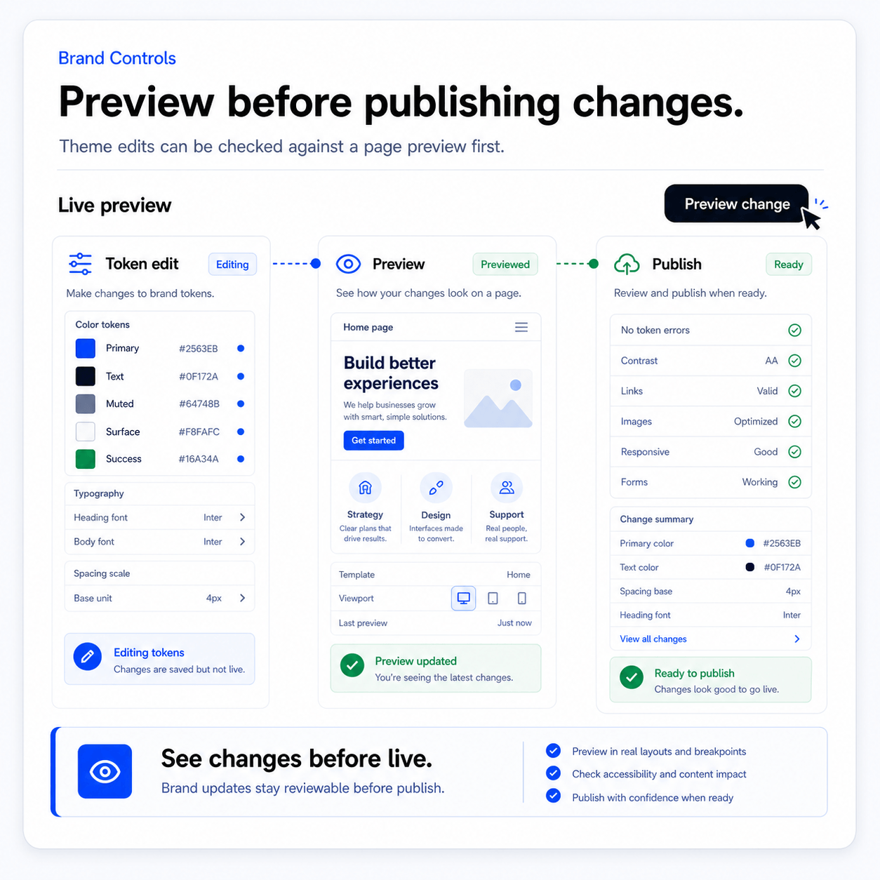
Page preview
Real page examples used to judge brand decisions.
Brand control flow
Set the visual rules once, preview them on real pages, apply them through theme parts, and keep every future page connected to the same brand system.
- 01
Define
Set the brand direction, type scale, colors, spacing, buttons, and section rhythm.
- 02
Preview
Test the design on real page patterns, content-heavy sections, forms, and store surfaces.
- 03
Apply
Use theme parts and tokens across pages, templates, and generated content.
- 04
Review
Check whether new pages still match the brand system.
Where this connects in the platform.
Use these connected surfaces to keep this workflow integrated with the rest of your website business.
Theme Gallery
The primary place for visual system decisions.
AI Website Builder
Reusable design values for color, type, spacing, and shape.
Pages & Publishing
Headers, footers, CTAs, and reusable branded sections.
Media Library
Real page examples used to judge brand decisions.
Make every page feel connected.
Change the brand without rebuilding. Reduce one-off design drift. Improve generated theme quality. Give teams a clearer visual system.